Libby
Driving user engagement with personalized recommendations to discover available content
New Feature
User Research
October - December 2024

Libby is a widely used app that connects users to their local libraries, providing easy access to eBooks, audiobooks, and other digital content across 90% of North American libraries and in over 78 countries. Its mission is to foster a love of reading and make library resources more accessible to the communities they serve. As a frequent user, I set out in this self-initiated project to explore, validate, and prototype a new feature aimed at solving a meaningful user problem.
BACKGROUND
Sole Product Designer
Skillset: Market/User Research, UI/UX Design, Prototyping
ROLE

80% of Libby users felt frustrated with the app’s discovery experience
PROBLEM
Through in-depth interviews with five current Libby users, I discovered the app’s browsing experience suffers from lack of availability, poor personalization, and navigation issues, leading to frustration, limited book discovery, and reduced user engagement.
Helping Libby users narrow down their choices faster
SOLUTION
Leveraging community-driven insights and readers’ preferences, I designed a new recommendation feature to connect readers to material they’ll love when facing availability roadblocks, enhancing user engagement and promoting available library content more effectively.
Libby users can access dynamic recommendation lists. These personalized feeds will showcase recommendations tailored to their reading history, preferences, and favorite genres that are available immediately. Users can further customize their experience by adjusting their preferences. For instance, audiobook enthusiasts can easily filter out eBook suggestions.
Understanding the problem
The goal of this research was to understand how Libby users search for and discover books in order to design a feature that enhances user satisfaction, improves content relevance, and supports more effective library collection management.
To explore this, I conducted a series of user interviews aimed at uncovering key pain points, behaviors, and unmet needs throughout the discovery journey. I hypothesized that users may face friction in finding relevant or appealing content due to limitations in current search and discovery features. This may lead to missed opportunities for engagement and underutilization of the library’s digital collection.
To validate and deepen these insights, I also performed a competitive analysis of comparable digital reading platforms. This helped contextualize user expectations, assess strengths and shortcomings of existing solutions, and surface opportunities for innovation within Libby.
Interviews
I conducted remote interviews with five current Libby users—and enjoyed chatting about books along the way. Our conversation focused on users’ book discovery and search process as well as their positive and negative experiences with the Libby app. Many described Libby as “life-changing” and credited it with helping them read more than ever before.
While most use the app to search for specific titles, long wait times often lead to frustration or giving up. Usability challenges, especially around navigation and learnability, often limit exploration, with users sticking to familiar paths and actions rather than staying engaged with the app.
Through the process of affinity mapping, I pulled out the following insights around users’ discovery habits. I found that 100% of users rarely relied on Libby for book discovery, mainly due to the following key barriers:
lack of availability and long wait times for desired titles.
lack of personalization.
difficulty navigating the app.
Key Insights
Availability is a major barrier to consistent Libby usage.
The lack of availability creates an accessibility issue.”
“
Navigation issues limit user discovery of new content.
I need to relearn how to navigate Libby every time I open the app. It makes me feel stupid.”
“
Discovery is disconnected from your reading habits.
[Libby] never feels synced to what you’re reading.”
“
Competitive Analysis
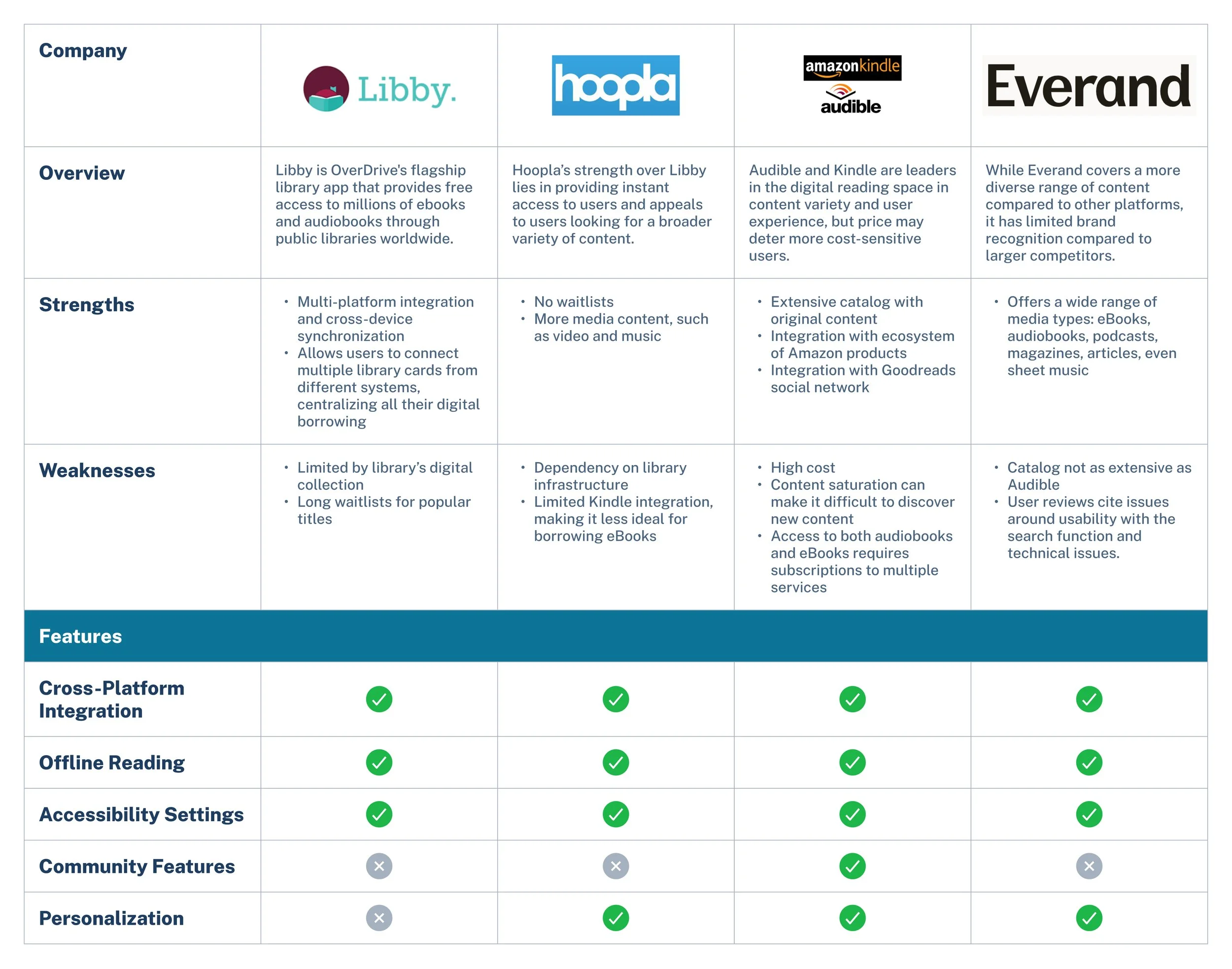
To identify opportunities for improving the Libby app experience, I also conducted a competitive analysis of both direct and indirect competitors in the digital reading and audiobook space. This included library-focused platforms as well as commercial services like Audible and Kindle. My goal was to understand how other products approach personalization, user engagement, content access, and community integration—highlighting gaps and strengths in Libby’s current offering.
Through competitive analysis, I found that while Libby offers a strong catalog, it lags behind apps like Audible and Hoopla in personalization and instant access. Users face long wait times and limited tailored recommendations. These insights revealed key opportunities for Libby to enhance personalization, reduce access friction, and create a more seamless, community-driven experience—strengthening its role as a gateway to discovery.
Based on my user research, I developed a working persona named Sierra to help define my target user and clarify the specific challenge I aimed to address within Libby. This foundation allowed me to set clear business and user goals:
Enhance discoverability of available titles, enabling users to quickly narrow down their options.
Leverage data-driven insights—such as popular genres and borrowing patterns—to inform collection development and tackle availability issues.
Boost collection engagement by encouraging patrons to borrow more and explore a wider range of content.
Defining the target user & project goals
Defining the solution
The problem—defined
After uncovering several opportunities to improve the Libby experience, it was time to narrow the focus and identify where design could make the biggest impact.
Users shared a wide range of pain points—from navigation challenges to availability issues—one unmet need consistently stood out: lack of discovery. Many users struggled to find new books they’d enjoy within Libby. This pointed to a clear opportunity to enhance Libby’s discovery experience in a way that could boost engagement, support, and personalized reading journeys, and better connect users with the library’s collection.
I drafted several problem statements from the working persona and synthesized research data, each with corresponding “How Might We” statements, and chose the one that felt the clearest and most important to users. From there, it was time to start brainstorming.
How might we help readers like Sierra find alternative titles that match their tastes and are immediately available?
Solution: Tailored recommendations
While exploring ways to improve discovery in Libby, I aimed to balance user needs, business goals, and the limitations of library lending. Users wanted faster, more relevant book suggestions—but without disrupting existing habits or overlooking catalog constraints.
Technically, this meant ensuring integration with diverse library systems, regional scalability, and strong privacy. From a design standpoint, recommendations had to be intuitive and consistent with Libby’s UI.
Instead of overhauling search or browsing, I focused on a strategic solution: curated, dynamic recommendation lists. These helped users find available, relevant titles more easily while supporting library systems and minimizing decision fatigue.
Designing the solution
Wireframes
Starting in low-fidelity, I worked on exploring multiple solutions to lay out a recommendation experience that:
Highlights the new feature within the existing information architecture.
Organizes recommendations logically and in a streamlined way.
Allows users to narrow down their options efficiently based on their mood and needs.
Gives user control over tailoring their recommendations through feedback mechanisms and settings.
User flow to view recommendations and customize preferences
Mid-fidelity testing
To assess usability and appeal, five users completed two tasks via an asynchronous usability test:
1) finding a memoir via personalized recommendations, and
2) editing their genre preferences.
Both tasks had a 100% success rate, with quick completion times (64.3s and 48.5s) and high ease-of-use ratings (4.2 and 4.8 out of 5 respectively).
Users appreciated the feature’s simplicity and the “While You Wait” list, which made browsing less overwhelming. However, the feature’s low visibility, unclear availability cues, and excessive scrolling hindered the experience revealed there was still work to be done.
One user brought up wanting social-style suggestions, like a “Readers Also Enjoyed” list. While the idea is great, it’s a bit tricky to implement right now due to privacy concerns and a lack of community features. Still, this feedback highlights a broader need for social cues in book discovery—something Libby may want to explore down the line.
High-fidelity wireframes
After incorporating the initial round of feedback, it was time to move into high-fidelity design. I applied Libby’s design system and color palette to ensure consistency. Based on insights from mid-fidelity testing, I identified and prioritized the following key areas for improvement (listed in order of importance):
Improve the visibility and placement of the feature to better align with typical user flows.
Reduce the need for scrolling by grouping content more effectively and introducing filters.
Increase transparency around how recommendations are generated.
Problem #1: Easily overlooked
Placing the recommendation list on the “Library” tab seemed like the logical choice given the librarian-curated recommendations are currently there, but user testing revealed users don’t often view that page.
Solution: Making the feature easier to find
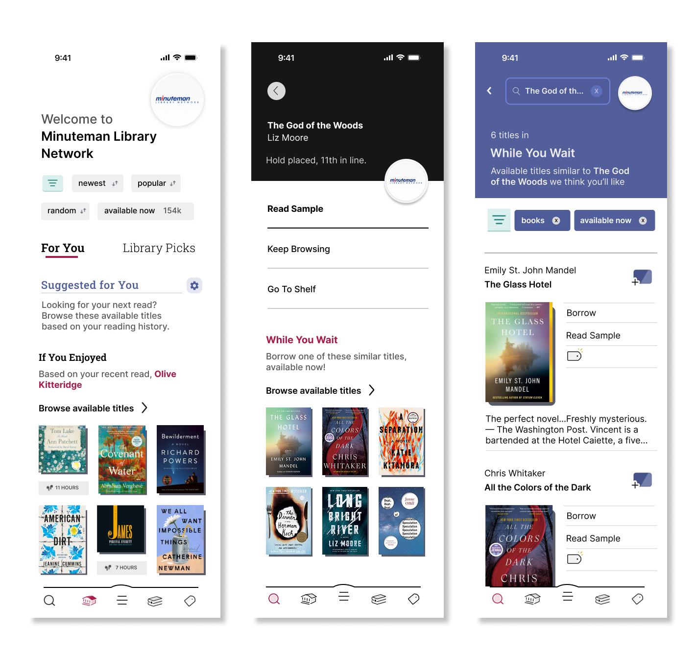
Users often missed the personalized browsing feature because it didn’t align with their usual flow through the app. I explored new placements that better match common user behaviors, like showing recommendations after placing a hold or finishing a book.
New “While You Wait” list appears after placing a hold
Problem#2: Too much scrolling
During testing, half of the users didn’t notice the content further down the page, meaning they missed key recommendations simply because they didn’t scroll far enough.
Solution: Streamlining the browsing experience
In an attempt to reduce friction and make discovery easier, I reorganized the layout to group content more clearly and added a prominent filter option. My goal was to allow users to zero in on the recommendation overview—without having to scroll endlessly. I also addressed confusion around how recommendations were generated with a brief description on what recommendations are based on.
Reorganized “Suggested for You” page
High-fidelity usability testing
In a recent round of usability testing, I explored how five participants interacted with a high-fidelity prototype of Libby’s new personalized recommendations feature. The goal was to understand how easily users could navigate to the feature, adjust their preferences, and find a book they’d want to read—specifically, an available memoir eBook.
Overall, while there was a 100% task completion rate, several friction points emerged. While users liked the idea of getting tailored book suggestions, many struggled to notice the feature in the first place. The new feature callout—intended to help—actually distracted users and contributed to cognitive overload. Once inside the recommendations, confusion around filters, too many CTAs, and unclear labels made the experience feel more complicated than it needed to be.
When it came to finding an available book, every participant emphasized the importance of showing only what's ready to borrow—immediacy was key.
Key Iterations
In this iteration, I overhauled the general recommendation page, focusing on reducing cognitive overload and encouraging more intuitive, passive discovery of personalized recommendations.
The usability testing feedback revealed I was asking users to do too much. My goal in this iteration was to streamline the experience, making passive discovery more enjoyable without requiring users to configure or filter too much. Here’s a breakdown of the key iterations:
Validating the solution
I put the redesigned general recommendations page to the test again. It was met with strong positive feedback. After completing the usability testing, 80% of participants shared that the feature would increase their engagement with Libby, noting that it made it easier to discover new titles they might not have found on their own.
Participants appreciated the simplicity of the experience, the focus on availability, and the personalized touch. By reducing friction and offering more relevant suggestions upfront, the new design aligned closely with users’ reading habits and goals—especially when looking for something to read right now.
This validation reinforced the value of passive discovery as a core part of the Libby experience and highlighted the potential for personalization features to drive both user satisfaction and retention.
Takeaways
Designing within constraints
With a full redesign out of scope, I focused on high-impact updates that aligned with Libby’s existing design system and technical constraints. This meant working within established UI patterns, ensuring scalability across diverse library systems, and preserving a familiar experience for existing users.
The project pushed me to embrace progress over perfection to quickly test ideas—delivering incremental improvements that directly addressed user pain points. Flexibility was key: I often revisited earlier design decisions as new insights surfaced through testing and feedback.
Embracing a nonlinear process
What began as a centralized recommendation feature evolved, through iterative testing, into context-aware lists like “While You Wait.” My early hypotheses about where and how users wanted recommendations were often wrong—but being wrong was key. Each misstep revealed something new about user behavior and helped refine the experience. By embedding these lists throughout the app, I aligned the design with natural user flows and reduced cognitive load.
This process reinforced the value of staying open, questioning assumptions, and letting real-world feedback shape the solution. Ultimately, the feature became more intuitive and impactful—not because it followed the original vision, but because it grew through listening, learning, and adapting.