NYC Department of Education
Research-driven service improvements for NYC’s DoE teacher hiring support
User Research
Service Design
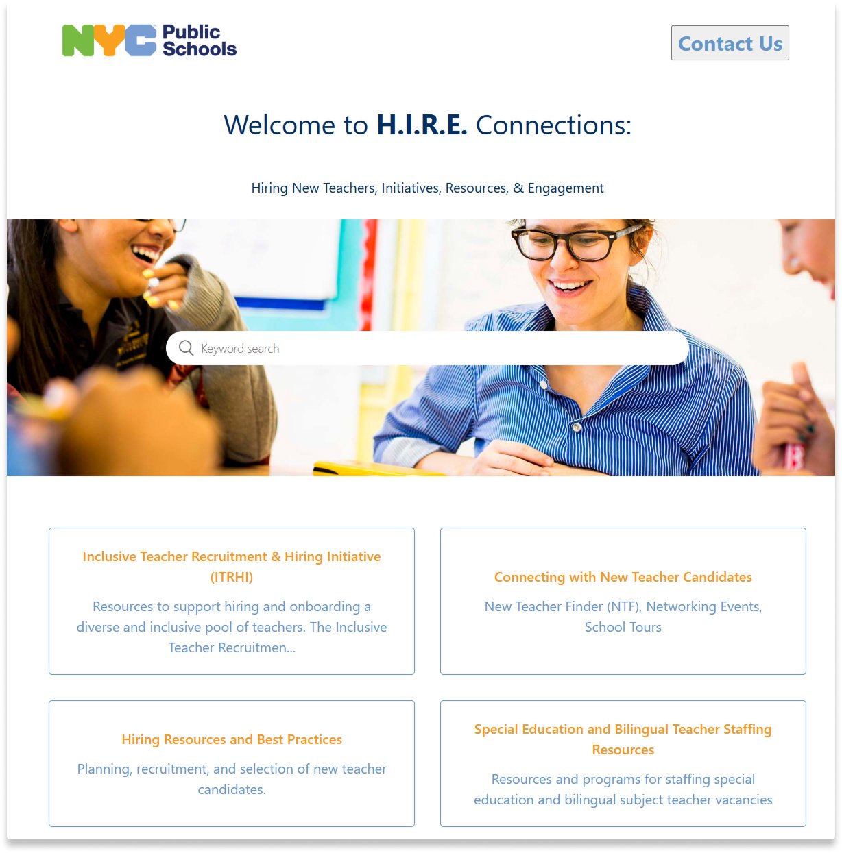
ABOVE The H.I.R.E. Connections site managed by the NYC DoE Office of Teacher Recruitment & Quality provides resources around teacher recruitment, hiring, and retention
Overview
Our small team undertook a six-month, citywide UX research project for the NYC Department of Education (DoE) to understand how schools approach hiring and identify ways to improve DoE support and resources. Through focus groups with 10+ principals and assistant principals across diverse school contexts, we uncovered critical pain points in communication, resource discoverability, and specialized hiring, delivering insights that are now shaping both immediate fixes and long-term strategic improvements.
In collaboration with other researchers, I co-designed and co-facilitated six focus groups with principals and assistant principals, delivering actionable outcomes, including thematic reports, usability test documentation, and workflow visualizations, which the DoE is using to improve their support and resources, improve communication, and inform ongoing hiring process improvements.
User Researcher
ROLE
6 months
TIMELINE
The DoE plans to use our findings in both short- and long-term ways. Some quick fixes were identified — small changes that could meaningfully improve communication and awareness in the hiring process, such as integrating Vice Principals into communication channels. Other recommendations will require further exploration, especially those that involve areas outside the DOE’s direct control. Importantly, they plan to use our thematic reports and usability test documentation to inform ongoing efforts to support schools and streamline hiring practices.
IMPACT
NYC's Department of Education (DoE) supports 1,800+ schools in hiring approximately 5,000 teachers annually. While the DoE provides centralized resources and support systems, processes can vary widely across schools.
The DoE Teacher Recruitment & Quality office knew that schools across the city had a wide range of hiring experiences, but lacked insight into what made some more successful than others. With a new law coming into effect that anticipates the need for additional hiring, understanding the full hiring ecosystem became more critical to better support administrators.
Research Questions:
How do different schools experience the hiring journey from recruitment to onboarding?
Which DoE resources are actually used, and which are unknown or underutilized?
What best practices have successful schools created independently?
Where are the biggest friction points that the DoE could address?
How do specialized hiring needs (multilingual, special education) compound existing challenges?
Background
Research Design & Methodology
Methodology
We met with the client to understand their goals and proposed running a series of focus groups. We selected focus groups as our primary method to:
Capture diverse perspectives and peer-to-peer learning in real-time
Observe how school leaders discuss and problem-solve hiring challenges together
Efficiently gather rich qualitative data from senior administrators
The client shared a list of question topics they wanted to cover, and the team collaboratively refined and expanded on these in working sessions.
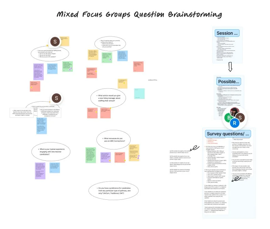
The focus group format became an intervention itself. Participants actively shared strategies and solutions with each other, revealing the value of facilitated peer networks. This organic collaboration informed one of our key recommendations.
ABOVE Collaborative brainstorm in FigJam to refine questions
Session Structure
We conducted six 90-minute focus groups across two rounds to understand hiring workflows, pain points, and resource needs.
Round 1: General Intake Three sessions with different participants explored broad patterns across the hiring experience. Each session was co-facilitated by two researchers, with one leading each half while the other captured notes and follow-up questions. I participated in all sessions to observe facilitation techniques and help adjust our approach based on real-time feedback.
Sessions covered:
Current hiring workflows and timelines
DOE resource usage and awareness
Pain points and workarounds
Success stories and peer recommendations
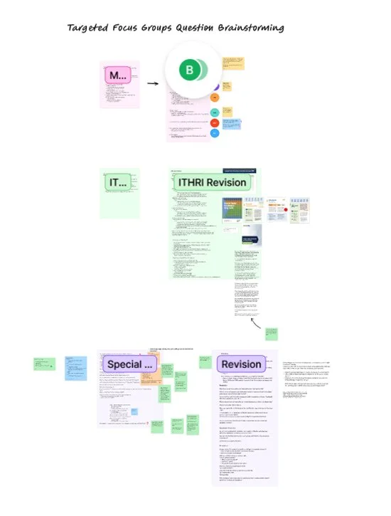
Round 2: Specialized Topics Three sessions with returning participants focused on specific hiring challenges:
Special education teacher hiring
Multilingual teacher hiring
The ITRHI platform (DOE's inclusive hiring and retention resource tool)
Before each session, we refined discussion guides based on previous focus group insights and reviewed them with the client. This deeper dive helped us clarify tool-specific challenges and build detailed thematic recommendations.

Unexpected Insight
Constraints & How We Adapted
Our approach required several strategic adaptations due to real-world constraints:
Privacy restrictions prevented our team from being able to perform direct system testing with administrators. We designed research artifacts the DoE team could use internally, including detailed usability test protocols with pre-written scenarios that DoE employees (with proper system access) could facilitate with administrators. This built the DoE's internal research capacity beyond our engagement.
End-of-year timing challenges required flexible scheduling across multiple weeks and early recruitment. Despite conducting research during administrators' busiest season, we maintained 88% attendance through strategic planning and DoE partnership leverage.
Incomplete operational visibility made it difficult to assess implementation feasibility when developing recommendations. With more access, we could have delivered more targeted, implementation-ready solutions that better reflected the DoE’s internal workflows and constraints.
Research Synthesis
Thematic Analysis Process
We used a structured approach to analyze findings across all six focus groups:
Individual analysis: Each team member focused on specific sessions, identifying recurring themes and capturing significant quotes that illustrated key experiences and challenges.
Collaborative synthesis: We conducted an affinity mapping exercise to identify patterns across sessions, clustering related insights and revealing interconnected themes.
This process allowed us to move from session-specific observations to cohesive, cross-cutting insights that shaped our final recommendations.
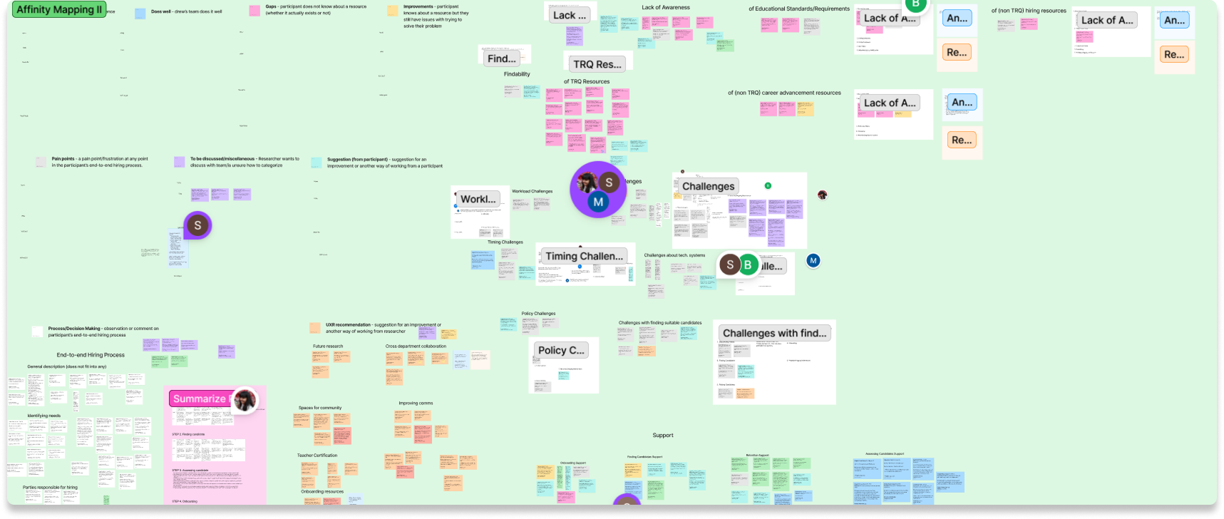
ABOVE Snapshot of collaborative affinity mapping & synthesis within Figjam
Journey Map
My team member and I led the creation of a hiring journey map to deepen our insights and better understand pain points along the hiring journey, This served to better illustrate areas where the DoE could focus their intervention efforts from discovering hiring needs to onboarding and retention, helping us to identify cross-cutting themes and areas where the process needs more support.
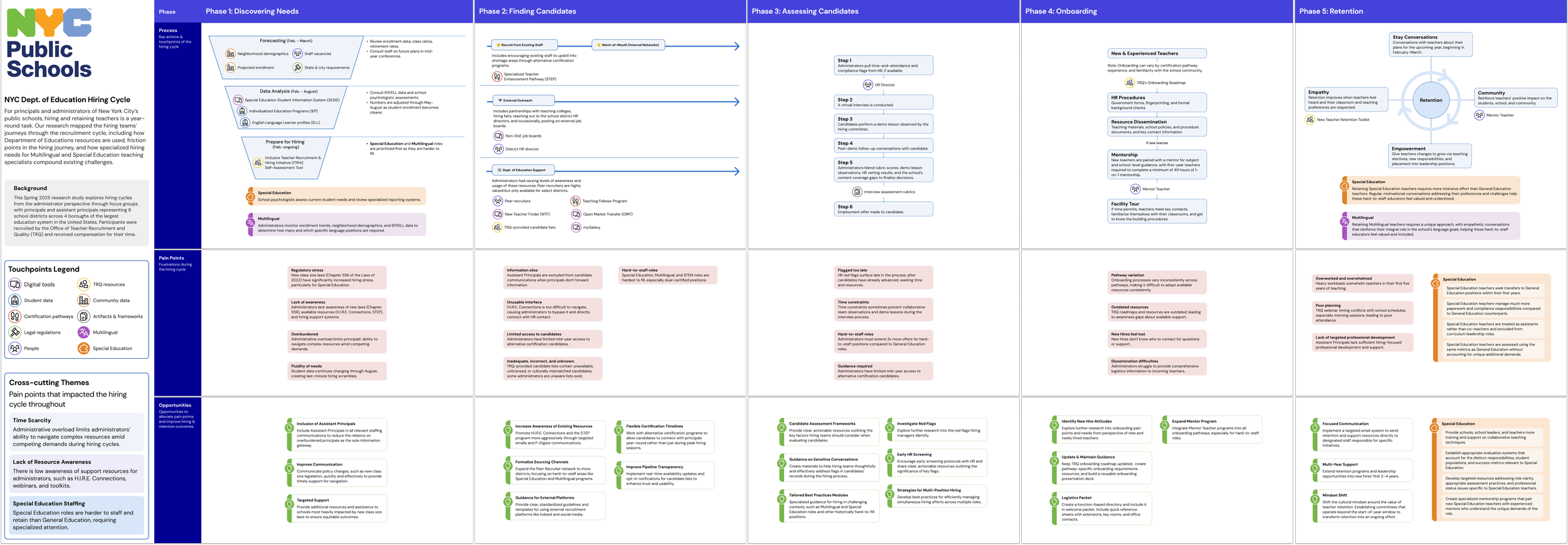
ABOVE Detailed journey map of hiring process outlining key pain points and opportunties.
Key Insights
Lack of awareness of support resources: Administrators were often unaware of the support resources available to them through the DoE.
Assistant Principal (AP) Exclusion: APs are often more "boots on the ground" with hiring but feel excluded from TRQ communications.
The "Offer Gap": For hard-to-staff positions, administrators must extend three times as many offers as they do for General Education roles due to low acceptance rates and high competition.
Timeline pressure: Special Ed & multilingual positions require earliest outreach (Feb-Mar) and have the longest fill times.
Dual certifications: Teachers with multiple licenses (e.g., Special Ed + bilingual, Gen Ed + Special Ed) are highly sought but extremely scarce.
Professional networks preferred: Word of mouth and referrals outperform TRQ candidate lists, which are used primarily during time crunches.
Retention challenges: Special Ed teachers feel undervalued and excluded from leadership despite specialized expertise. While leadership uses "motivational conversations" to make them feel valued, there is a systemic need for specialized mentorship and evaluation systems that recognize their distinct responsibilities.
Recommendations
Our research identified strategic opportunities across the hiring lifecycle:
Expand recruitment networks: Extend peer recruiter programs to all districts, focusing on hard-to-staff areas like Special Education and multilingual roles. Create formal pathways for paraprofessionals to earn high-need certifications and streamline identification of dual-licensed candidates.
Strengthen assessment support: Provide hiring teams with candidate evaluation frameworks, guidance for addressing red flags sensitively, and best practices for managing simultaneous hiring across multiple positions—especially for schools impacted by new class size legislation.
Improve retention in hard-to-staff roles: Launch structured mentorship programs and collaborative teaching initiatives. Address Special Education teacher frustrations around inappropriate role use and assessment practices. Explore compensation incentives tied to multilingual and Special Education certifications.
Enhance communications: Include Assistant Principals in hiring communications, coordinate webinars with school calendars (with recordings provided), and implement real-time candidate list updates with transparent procedures to build trust and usability.
Build certification pathways: Encourage current educators to pursue high-demand certifications through targeted professional development. Enable alternative certification programs to connect candidates with principals year-round rather than just during traditional hiring cycles
Outcomes & Impact
Our research equipped the NYC DoE Office of Teacher Recruitment & Quality (TRQ) with actionable, data-driven insights to address critical gaps across the full hiring and retention lifecycle.
Strategic foundation for improvement: The comprehensive research reports equipped the DoE with data-driven recommendations spanning recruitment network expansion, candidate assessment frameworks, and retention strategies for hard-to-staff positions. These insights directly address the pressures administrators face from new class size legislation and chronic shortages in Special Education, multilingual, and STEM roles. This work positioned the DOE to make informed decisions about resource allocation and prioritization, communication strategies, and support systems that directly impact their ability to recruit and retain qualified teachers.
Internal research capacity building: By delivering ready-to-implement usability testing protocols and detailed facilitation guides, we enabled the DoE team to conduct future research independently.
Roadmap for continued work: Our future research recommendations provide the DOE with a clear path forward, including specific areas for platform improvements, teacher onboarding support, and resource hub development that address both immediate needs and long-term infrastructure goals.
In addition, anticipated measurable impact includes:
103% increase in target audience reach — extending P-Digest emails to assistant principals (3,538) alongside principals (1,742) more than doubles direct communication to school leadership.
14+ new resources created if TRQ implements the full set of recommended materials, directly expanding support for recruiters and administrators.
6 new collaboration networks spanning distinct dimensions of NYC DoE's organizational hierarchy, strengthening cross-functional coordination across the system.
Note: We are awaiting feedback from the DoE on how these findings will be applied going forward, and plan to update this section with confirmed outcomes once available.
Takeaways
This project introduced me to the complexity of service design research—where understanding one user group's needs requires mapping an entire ecosystem of stakeholders, systems, and constraints.
Research as intervention: Focus groups became more than data collection—participants organically shared strategies and solutions with each other, revealing that facilitated peer networks could be a retention tool itself. This taught me to observe not just what participants say, but how the research format shapes their experience and uncovers unexpected opportunities.
Collaborative synthesis requires alignment: Working across a research team revealed how differently each person processes and organizes information. What seemed like a straightforward analysis task became complex when four researchers brought distinct mental models to synthesis. Establishing our analysis approach upfront—dividing sessions, defining what constitutes a "theme," and aligning on our affinity mapping process—was essential. I learned that successful collaborative research requires explicit agreements about methodology, not just divided labor.
Designing around invisible constraints: Understanding the full service required navigating what we couldn't access. Privacy restrictions prevented direct system testing, and incomplete operational visibility limited our ability to assess recommendation feasibility. I learned to design research artifacts (like our usability protocols) that work within constraints while still delivering value—and to explicitly flag where limited access affects recommendation specificity.
Looking ahead: With more time, I would have advocated earlier for post-implementation tracking mechanisms to measure recommendation impact. In a government context especially, clear measures of impact help clients make the case internally for continued investment in research-informed decision-making.