Altru
Empowering nonprofit organizations to make data-driven decisions faster
Product Design
Responsive Website
March - April 2025

BACKGROUND
Nonprofit organizations must maximize their mission impact with limited resources while serving their communities effectively. Without proper technology solutions, staff often become overwhelmed by administrative tasks, reducing their capacity for meaningful work.
This project aimed to design a responsive dashboard for nonprofits to streamline organizational processes and improve operational efficiency.
ROLE
Sole Product Designer
Skillset: User Research, Product Design, Visual Design & Branding, Wireframing & Prototyping, Data Visualization

PROBLEM
100% of nonprofit employees expressed frustration with fragmented systems.
Nonprofit teams need centralized tools to save time and access insights faster. I conducted in-depth interviews with 5 nonprofit employees working across departments, and 100% expressed frustrations with the need to gather data across fragmented systems to track key KPIs and impact data. With so much time spent on data retrieval, teams often struggle to present a unified story of their impact.

Streamlining nonprofit operations and collaboration
SOLUTION
An integrated dashboard solution which enables nonprofits to use data for storytelling and planning, helping to clarify key KPIs, boost efficiency and collaboration, and support real-time decision-making.

Although I’ve volunteered at various nonprofits for years, this project gave me the opportunity to understand the sector from a new perspective. I wanted to explore how a responsive dashboard could help nonprofits address some of their biggest challenges—like managing data, volunteer management, and demonstrating impact. Through SME interviews and a competitive analysis, I gained a deeper understanding of how nonprofits operate and where technology can make the most difference.
Understanding the problem
Interviews
Through interviews with five nonprofit professionals across development, communications, and volunteer management roles, several consistent themes emerged:
System Integration Challenges: Many teams rely on a patchwork of tools—like CRMs, spreadsheets, and scheduling apps—that don't integrate well, leading to inefficiencies, duplicate work, and communication breakdowns.
Data Collection and Reporting Burdens: Data collection and reporting are time-intensive, making it difficult to track impact or support timely, informed decision-making.
Volunteer Scheduling Difficulties: Volunteer scheduling surfaced as a challenge, with confusion around shifts and a lack of streamlined communication.
Responsiveness across Devices: The ability to access key tools and data on mobile and tablet devices was also seen as essential, especially for staff working events.

Key Insights
Fragmented systems lead to inefficiencies, duplicate work, and communication breakdowns.
The biggest challenge is consolidating the data into one unified report for board meetings or other stakeholders. It often requires manually pulling information from different places. I can’t believe how much time it eats up!”
“
Nonprofits struggle to turn data into actionable insights.
“
"The time I spend on figuring out data discrepancies takes away from the time I need to think about improving our programs or fostering new partnerships."
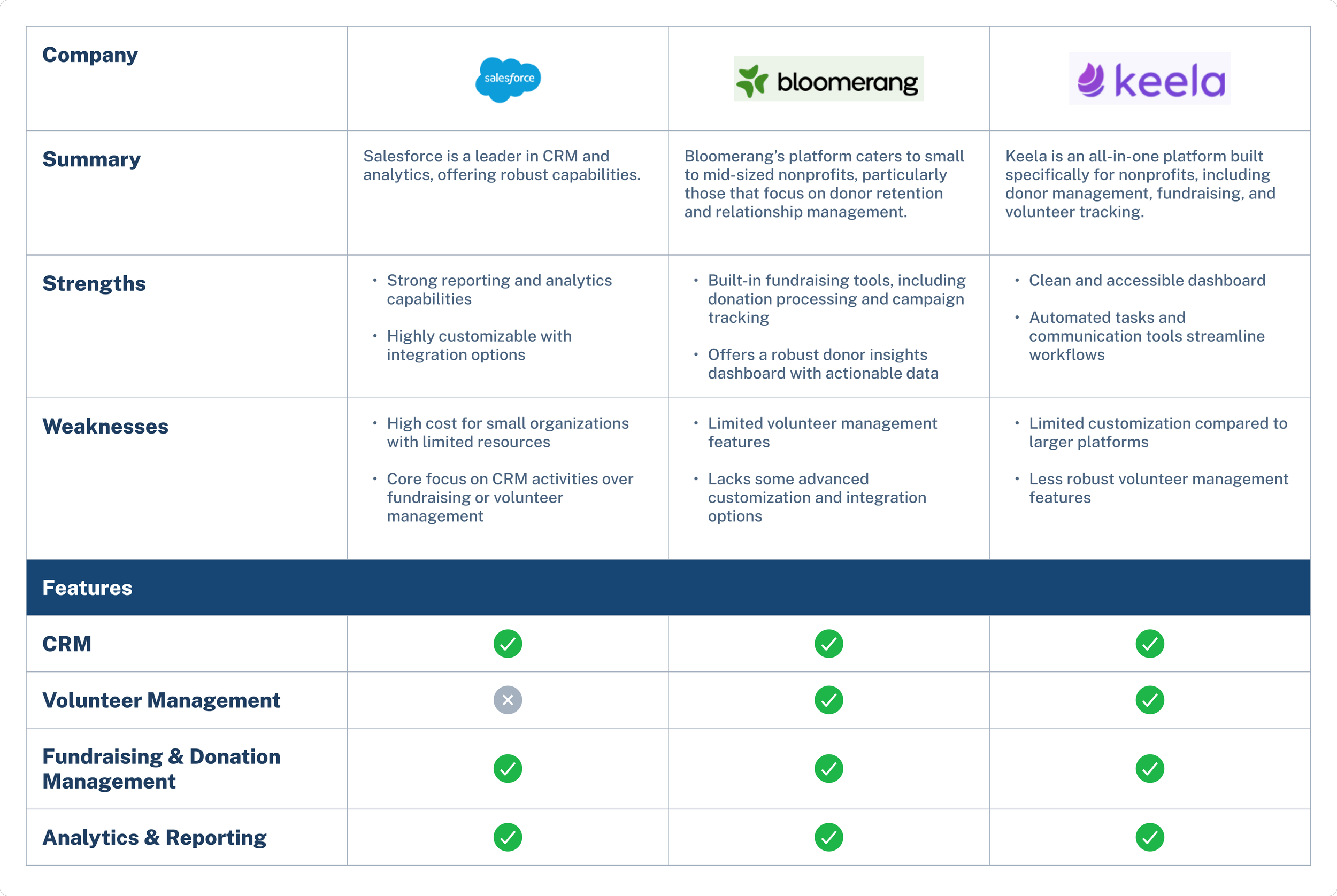
Competitive Analysis
Through this competitive analysis, I identified clear opportunities to design a more integrated, user-centered platform. Many nonprofits—especially small to mid-sized ones—struggle with fragmented systems and costly integrations across CRM, fundraising, and volunteer management tools. I saw a strong case for an all-in-one solution that simplifies workflows, enhances collaboration, and reduces operational friction. The research also revealed gaps in volunteer management and mobile and tablet accessibility—areas often treated as secondary but essential for real-world impact.
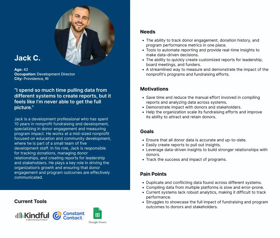
User Persona
From research, I developed a primary user persona named Jack, a development professional at a mid-sized nonprofit, whose role involves managing donor relationships, running engagement reports, and communicating program impact. Jack is organized, mission-driven, and collaborative, but often faces time-consuming workflows, difficulty accessing key insights, and limited visibility into team activities. His needs centered around streamlining daily tasks, simplifying reporting tools, and enabling better collaboration.
Defining the product
At the outset of the project, my initial research spanned several functional areas within nonprofits, from development to program and volunteer management. However, as I delved deeper, it became clear that the scope needed to be more focused to ensure meaningful impact within the project timeline.
Problem Statement
After gathering the research findings, I drafted several problem statements and selected the one with the greatest impact.
Nonprofit teams need centralized tools to save time and access insights faster. 100% of users expressed frustrations with the need to gather data across fragmented systems to track key KPIs and impact data. With so much time spent on data retrieval, teams often struggle to present a unified story of their impact.
Product Vision
I positioned this new product around 4 key areas, addressing research insights and market gaps:
Defining the MVP
After reflecting on the most pressing challenges faced by nonprofit teams, I decided to narrow my focus to one of the key pain points: managing and acting on data. This decision allowed me to zero in on refining the most crucial workflows, particularly around data visualization and interaction within the dashboard. I identified the following key features:
Data Dashboard: Real-time visualization of key nonprofit metrics including fundraising progress, program outcomes, and organizational KPIs with customizable charts and filters.
Reporting: Automated generation of donor reports, grant compliance documents, and impact summaries with export capabilities for stakeholders.
Donor Dashboard: Centralized donor management with contribution history, engagement tracking, communication logs, and personalized outreach tools.
Volunteer Dashboard: Volunteer coordination hub featuring scheduling, hour tracking, and skill matching to optimize volunteer engagement.
Design
Through my research, I discovered that dashboards serve as a powerful storytelling tool that helps users quickly grasp key insights from large data volumes, with users reporting greater confidence in decision-making when data is clearly visualized. While competitive analysis revealed that existing solutions offer dashboards, they often lack the interactivity and customization that nonprofit teams need, particularly given diverse focuses and goals across departments. This presents an opportunity to create a solution that makes data accessible to everyone while saving time and enhancing team collaboration through clear, actionable insights.
User Flows
I created two user flows based on Jack, a nonprofit Development Director, focusing on running donor reports and adding follow-up notes after meetings.
These flows revealed key opportunities to streamline the dashboard by simplifying the reporting interface and making frequently used information more accessible. The process also helped identify important collaboration moments and edge cases (e.g. missing data, incomplete records) that needed to be handled gracefully.
Wireframes
I began by exploring a variety of layout options for the dashboard, experimenting with different ways to organize key information and actions based on user priorities. My goal was to balance clarity with functionality—ensuring that high-frequency tasks were easy to access without overwhelming the user with too much information at once.
After developing several initial wireframes, I gathered feedback through an initial round of usability testing to understand what was working and where improvements were needed. Their insights helped me identify areas that needed simplification, better hierarchy, or clearer visual cues.
Using that feedback, I refined the wireframes into higher-fidelity flows. This included fine-tuning layout structure, interaction patterns, and visual design to ensure the dashboard not only looked polished but also supported a more intuitive and efficient workflow.
During the high-fidelity phase, I optimized data visualizations for greater clarity and actionable insights, while streamlining dashboard controls to boost user efficiency.
KPI Dashboard
In the high-fidelity phase, I refined the report list to clearly display different report states and enable quick actions.
Report Generation
During the high-fidelity phase, I revamped the donor page by grouping actions to reduce UI clutter and confusion, and enabled quick actions like tagging directly from the list to enhance efficiency.
Donor Records
Usability Testing
To evaluate the usability of the dashboard, I conducted moderated testing with five nonprofit professionals, focusing on key workflows like managing donor records, generating reports, and viewing KPIs. The results were promising—participants completed 100% of tasks for KPI viewing and donor record updates, and 80% successfully ran a donor report. On average, tasks were completed in under 45 seconds with a strong usability rating of 4.6 out of 5. Notably, users appreciated the clean design, pre-filled templates, and straightforward navigation.
What I Heard from Users:
Some users found the KPI graphs a bit tricky to scan quickly—they wanted clearer labels and more context to make sense of the data at a glance.
When running reports, there was confusion around choosing between “Template” and “Custom” options—users weren’t always sure which one was right for their needs.
In the donor records, workflows came up a lot. People wanted to assign notes and set reminders. They also asked for sorting and filtering to make the data more manageable.
Key Iterations
Improve clarity and accessibility
BEFORE
While 60% of users found the KPI dashboard helpful, several struggled to interpret the data quickly.
AFTER
I enhanced accessibility by providing multiple ways to view information, including color coding, text labels, and icons. I also improved the data visualizations by adding clear labels and context, which helps users quickly scan and understand key insights.
Streamlining report workflows
BEFORE
Choosing between “Template” and “Custom” report options caused hesitation for 80% of users, which contributed to a lower task completion rate of 80%.
AFTER
I redesigned the report generation page to make it clearer and easier to navigate. By using progressive disclosure, I helped users understand the differences between options and guided them through the process without feeling overwhelmed.
Enhancing accountability and collaboration
BEFORE
Users struggled to take action on donor notes, with 45% reporting difficulty following up on important interactions.
AFTER
I added the ability to assign note owners and schedule follow-up reminders directly within the system—helping teams stay organized, delegate responsibilities, and ensure important tasks don't fall through the cracks.
Responsiveness
To meet the needs identified through user research, I designed responsive dashboard screens that adapt seamlessly across mobile and tablet devices. This enhancement provides professionals with greater flexibility, allowing them to access key features whether they’re in the office, in the field, or attending events.

Impact
The final prototype was tested by staff from small to mid-sized nonprofits, simulating real-world tasks. Compared to existing tools, users reported an estimated 40–60% improvement in workflow efficiency, with fewer steps and less time required for key tasks like donor follow-ups and insights, confirming the prototype’s potential to empower smaller nonprofits with streamlined, user-friendly tools.
Takeaways
This project taught me valuable lessons about designing products for specialized domains. Some key takeaways are:
Data needs context: Early testing showed users struggled to interpret visualizations—they needed insights, not just information. This shifted my approach from presenting data to actively supporting decision-making.
Scope strategically to go deep: My initial research uncovered pain points across fundraising, volunteer coordination, and data tracking. Narrowing focus to data-driven decision support allowed for more impactful solutions rather than surface-level fixes.
Test early and often with subject matter experts: Collaborating with nonprofit professionals and iterative usability testing ensured the final solution aligned with real day-to-day operations, not just theoretical workflows.
Complex workflows require thoughtful simplification: Designing for nonprofit operations like duplicate record management and cross-team collaboration taught me to distill technical complexity into intuitive interfaces for non-technical users.